5 Steps to Design Real-Time Dashboards
Learn how to design real-time dashboards through five essential steps for effective data visualization and decision-making.
Real-time dashboards provide live data, enabling quick decisions and instant insights. Here’s how to create one in 5 steps:
- Set Goals: Define the purpose, key questions, and metrics tied to business objectives.
- Connect Data Sources: Ensure secure, reliable, and up-to-date data feeds.
- Organize Data: Build a structured framework for fast, accurate reporting.
- Design Clear Charts: Use simple, relevant visuals like line or bar charts.
- Review Regularly: Test functionality, verify accuracy, and gather user feedback.
These steps ensure your dashboard remains actionable and aligned with your goals.
How to Create a Dashboard that Analyzes Data in Real-Time
Step 1: Set Dashboard Goals
Start by defining clear goals for your dashboard that help inform decisions and provide immediate insights.
Identify Key Questions
Pinpoint the exact questions your dashboard should address:
- What business goals should the dashboard align with?
- Who will use the dashboard, and what insights do they need to make decisions?
- What is the dashboard's primary focus and purpose?
Align Metrics with Objectives
Ensure your metrics are tied to specific goals:
- Connect metrics directly to business objectives.
- Tailor metrics to meet the needs of different stakeholders.
- Focus on outcomes that encourage prompt decision-making.
Once your goals and metrics are set, establish reliable data sources to power your real-time dashboard.
Step 2: Set Up Data Sources
Once your goals are clear, the next step is to connect your data sources. Make sure to document how each source is accessed, how often it updates, and the backup processes in place.
Choose the Right Data Sources
Identify the systems and live feeds that align with your metrics. Then, establish secure, authenticated connections to ensure safe data flow.
Ensure Data Quality
Use automated checks to keep incoming data accurate. Regularly audit your data sources to confirm they meet the needs of your dashboard.
Finally, organize the verified data to make it easy to retrieve and display.
Step 3: Build Data Structure
With your data sources connected and validated, the next step is organizing the data to ensure quick access and dependable reporting.
A well-structured data setup is key to creating fast and accurate visualizations.
Create a Data Framework
Start by defining a schema that groups tables by subject area, such as sales, marketing, or operations. Use fact tables and dimension tables to handle necessary aggregations and drill-downs effectively. To improve query performance, implement strategies like partitioning and indexing.
Clean and Format Your Data
Standardize formats for elements like dates, currencies, and identifiers across all tables. Build on the audits from Step 2 by removing duplicates, addressing or flagging missing values, and ensuring data types are consistent. Apply any necessary transformations, such as rounding or categorization, to make the raw data ready for reporting.
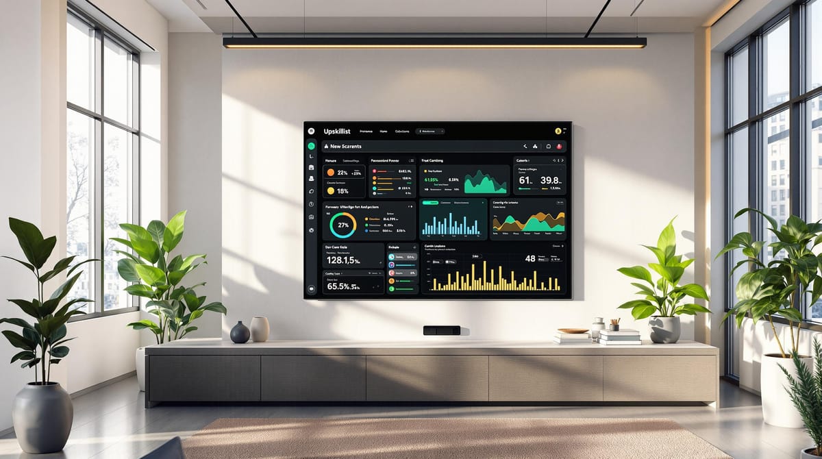
Step 4: Create Clear Charts
Once your data structure is in place, focus on crafting visualizations that directly address your dashboard's main questions. The goal is to present your insights in a way that's easy to understand and highlights key patterns instantly.
Choose the Right Chart
Match your metrics with the most suitable chart type:
- Use line charts to show trends over time.
- Opt for bar charts to compare categories effectively.
Focus on Simplicity
Clarity is key when designing charts. Stick to these guidelines:
- Keep layouts clean with plenty of white space, clear labels, and consistent color schemes.
- Avoid extra decorations or elements that might distract from your data.
Step 5: Review and Update
Make sure your dashboards stay accurate, functional, and useful by testing and refining them regularly.
Ensure Everything Works
- Test all features to confirm they function as expected.
- Cross-check key metrics with your source systems to verify accuracy.
Collect Feedback and Make Improvements
- Gather input from users about any issues or suggestions for improvements.
- Use this feedback to update the dashboard, then test the changes thoroughly.
Always ensure updates align with your dashboard's goals and key metrics. Revisit your original objectives from Step 1 to confirm the updates remain relevant and effective.
Conclusion: Next Steps
Building effective real-time dashboards means finding the right balance between usability and functionality. Follow these five steps as a reliable guide to ensure your dashboards remain useful and impactful.
If you're looking to improve your skills, consider Upskillist's CPD-certified courses on data visualization and dashboard design. The program includes over 20 hours of expert-led, self-paced lessons, regular assessments, lifetime access, a free 4-week trial, and access to their full course library for $39.99 per month.
Here’s how you can evaluate and improve your dashboard:
- Compare your dashboard to the five-step framework.
- Gather user feedback to identify areas for improvement.
- Create a plan to implement updates and put it into action.