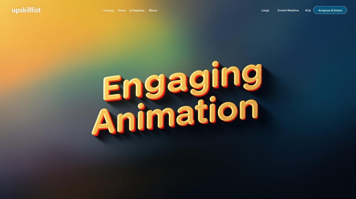
Typography in Motion: 7 Design Principles
Explore seven essential principles of kinetic typography to create engaging animated text that captures attention and conveys emotion effectively.
Want your text to grab attention and connect with your audience? Kinetic typography, or animated text, can make your designs more engaging and impactful. Here are the 7 principles you need to follow:
- Choose the Right Font: Opt for clean, readable fonts like Helvetica or Roboto for smooth motion.
- Set the Right Speed: Sync animation speed with audio or pacing to ensure readability.
- Create Clear Text Order: Organize text logically (left-to-right, top-to-bottom) for easy flow.
- Keep Motion Uniform: Use consistent animations and pacing to avoid distractions.
- Make Text Easy to Read: Use proper spacing, high contrast, and aligned text.
- Mix Text with Graphics: Combine text with visuals to enhance your message while maintaining balance.
- Connect with Your Audience: Match text motion, colors, and sound to evoke the right emotions.
Master these principles to create animations that not only look great but also communicate effectively and emotionally.
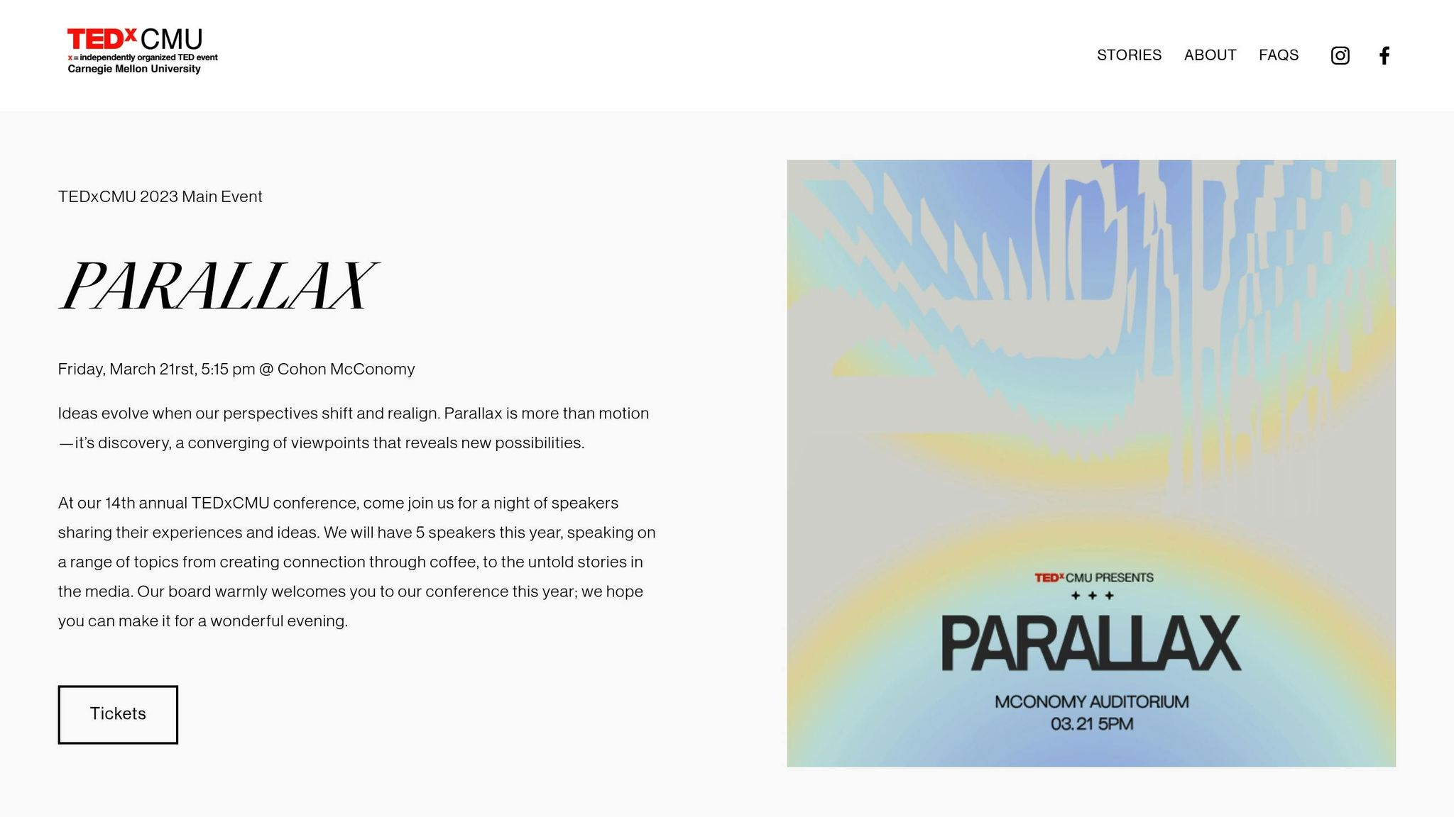
The art of kinetic typography: Dan Boyarski at TEDxCMU
1. Choose the Right Font
Pick fonts that align with your message and work well in motion.
Sans-serif fonts like Helvetica, Arial, and Roboto are often preferred for motion design. Their clean lines and simple shapes make them easy to read, even at different sizes or when animated.
Here are some important considerations when choosing fonts:
- Readability in Motion: Stick to fonts that stay clear and legible when animated. Avoid overly decorative or script fonts that can become hard to read.
- Weight Consistency: Select fonts with even stroke thickness to maintain visual balance during animations.
- Letter Spacing: Ensure enough spacing between letters (tracking) so the text doesn’t blur together when in motion.
The font you choose sets the tone for your design. Up next, let’s dive into how motion timing can improve readability.
2. Set the Right Speed
Getting the animation speed just right is key to making kinetic typography both engaging and easy to follow. Smooth, consistent timing helps viewers process the text and understand the message.
If the text moves too quickly, important details can be lost. On the other hand, if it’s too slow, viewers may lose interest. Sync text transitions with audio elements like voiceovers or background music to create a natural, cohesive rhythm.
Also, think about structuring your text flow to make the message even clearer.
3. Create Clear Text Order
Organize animated text with a clear and logical structure. Western audiences typically read from left to right and top to bottom, so your design should align with this natural flow.
Here’s a simple way to structure your text:
- Primary message: Position it to enter from the left or center.
- Supporting points: Arrange them to flow vertically, top to bottom.
- Call to action: Place it at the bottom right to conclude the sequence.
This approach ensures your design maintains a consistent and easy-to-follow motion.
4. Keep Motion Uniform
Maintaining consistent motion is key to delivering a polished and cohesive design. When text elements move in conflicting ways, it can distract viewers and dilute your message.
Here are a few tips to ensure a seamless look:
- Stick to the same entrance and exit animations for similar text elements.
- Keep timing and pacing consistent across transitions.
- Use the same easing curves throughout.
- Adjust animation speed based on the text’s size or length.
Text movement should follow a clear and consistent direction. For example, if your main heading slides in from the left, apply that same movement to other elements for a steady visual flow.
Make sure all text layers work together as part of a coordinated system. This means aligning animation styles, syncing transition timing, and balancing movement to avoid jarring differences.
5. Make Text Easy to Read
Once you've nailed smooth motion, it's time to focus on making your text clear and easy to read. Clear text ensures your design connects with your audience effectively.
Here are some tips to keep your kinetic typography readable:
- Add enough spacing: Avoid cramming letters or words together so they don't blend into a hard-to-read mess.
- Pick high-contrast colors: Choose color combinations that make the text stand out clearly against the background.
- Stick to consistent alignment: This helps guide the viewer's eyes naturally across the design.
6. Mix Text with Graphics
Combining text with graphics can create a more engaging and visually appealing experience. By blending these elements thoughtfully, you can enhance your message and captivate your audience.
Here are some tips to make this combination work effectively:
Establish Visual Hierarchy
- Use size differences to highlight key elements. Larger text can draw attention, while smaller graphics support the message.
- Place the most important text in the foreground.
- Keep supporting graphics subtle to avoid distractions.
Leave Space to Breathe
Ensure at least 20% negative space around your elements to avoid a cluttered look.
Coordinate Motion
If your text moves (e.g., sliding in from the left), align graphic animations to follow similar paths or timing. This creates a seamless and unified experience.
Layer with Purpose
- Place text over solid backgrounds to ensure readability.
- Use semi-transparent overlays to separate text from busy graphics.
- Experiment with parallax effects, where text and graphics move at different speeds, for added depth.
Match Styles
- Pair clean, sans-serif fonts with simple, modern illustrations.
- Use serif or decorative fonts to complement vintage-inspired visuals.
Balance Visual Weight
- If your graphics are intricate, keep the text bold and straightforward.
- For detailed typography, stick with simpler graphics.
- Make sure neither the text nor the graphics overpower each other.
7. Connect with Your Audience
Once you've nailed the technical aspects, it's time to focus on creating an emotional connection. Kinetic typography can do more than just look good - it can make people feel something. Here's how:
Match Motion to Emotion
Let the movement of your text match the mood you're trying to convey:
- Smooth, flowing movements work well for calm or relaxed themes.
- Brisk, sharp motions bring energy and urgency.
- Bouncing text adds a playful vibe.
- Pauses can highlight key points or add drama.
Timing and Rhythm
Make your text animations flow naturally by syncing their rhythm with the cadence of spoken words or music.
Color Choices
Colors can amplify the emotion behind your message. Pick shades that align with the tone:
- Red conveys urgency or passion.
- Blue builds trust and a sense of calm.
- Yellow brings optimism and energy.
- Green symbolizes growth and balance.
Sound Pairing
When adding audio to your typography, make sure they work together seamlessly:
- Sync animations with the beat of the music.
- Time text reveals to match voice-over narration.
- Use subtle sound effects to enhance transitions.
Scale and Depth
Play with size and perspective to grab attention:
- Enlarge key words to emphasize their importance.
- Bring text forward to make it stand out.
- Create depth by moving text between foreground and background layers.
Contrast in Motion
Keep things dynamic by mixing contrasting elements:
- Alternate between fast and slow movements to add variety.
- Use large and small text to create visual interest.
- Combine bold animations with more subtle ones for balance.
Accessibility Matters
While aiming for impact, don't sacrifice readability:
- Keep motion smooth and easy to follow.
- Ensure text contrasts clearly with the background.
- Give viewers enough time to read each phrase.
- Offer static versions for those who prefer less motion.
These techniques help ensure your kinetic typography not only looks great but also connects with your audience on a deeper level.
Conclusion
Creating impressive kinetic typography requires mastering seven key principles that help produce polished and engaging animations.
Choosing the right fonts, syncing text with precise timing, and structuring a clear text hierarchy are crucial for crafting animations that hold the audience's attention.
Kinetic typography isn't just about technical execution - it also connects with viewers emotionally by blending visuals with their expectations and needs.
Begin with simple projects focusing on one principle at a time. Build a varied portfolio, seek constructive feedback, and refine your skills through regular practice. This hands-on approach naturally improves your abilities over time.
Each project offers a chance to try new techniques, expand your creative limits, develop your personal style, and stay aligned with current trends.
With consistent effort and lessons learned from both wins and challenges, you can create more engaging and powerful kinetic typography. These principles are the foundation for making animations that truly stand out.
To take your skills further, consider exploring expert-led courses on Upskillist to deepen your understanding of kinetic typography.